
Responsive Web Design Services That Create Better User Experiences
Build a website that looks professional and functions smoothly across desktops, tablets, and smartphones. Our Responsive Web Design Services combine mobile-first layouts, intuitive navigation, fast-loading pages, conversion-focused design, and SEO-friendly development to create a consistent experience on every screen.
Find Where Your Website Breaks Across Devices
We review your current layouts, navigation, forms, page speed, mobile usability, and screen-by-screen behavior to identify where visitors experience friction on phones, tablets, laptops, and desktops.
Plan a Flexible Experience for Every Screen
We structure page layouts, content hierarchy, menus, buttons, media, and conversion paths so each element adapts naturally to different screen sizes without sacrificing clarity or usability.
Build, Test, and Refine the Responsive Site
We develop the approved design, test it across devices and browsers, improve performance, and fine-tune important interactions so users receive a consistent experience wherever they visit from.
30 minutes. Practical website insights. No obligation.
Trusted to Build Websites That Grow Businesses











Why Websites Lose Users When They Do Not Adapt Across Devices

Layouts Break on Smaller Screens
Desktop-first pages can create cramped text, oversized images, overlapping sections, and awkward spacing on mobile devices. A responsive layout keeps important content readable and visually balanced across different screen sizes.

Navigation Becomes Harder to Use
Menus, buttons, forms, and calls to action need to work just as well on a phone as they do on a desktop. Poor mobile interactions can create unnecessary friction and make visitors leave before completing an important action.

Slow Mobile Performance Hurts Engagement
Large media files, unnecessary scripts, and inefficient page structures can make mobile pages feel slow. Better responsive development balances visual quality with faster loading and smoother browsing across devices.

Inconsistent Experiences Reduce Trust
Visitors may move between smartphones, tablets, laptops, and desktops before taking action. If the site behaves differently on each device, it can make the experience feel less polished and create uncertainty around your brand.
Creating Flexible Websites That Work Across Every Screen
We combine adaptive layouts, mobile-friendly UX, technical performance, search-friendly development, and conversion planning to create a consistent experience across devices.
Mobile-First Layout Planning
We consider smaller screens early in the design process so content, navigation, buttons, images, and forms remain easy to use without sacrificing the desktop experience.
Responsive Navigation & User Journeys
Menus, calls to action, conversion paths, and page structure are adapted so visitors can move through your website naturally whether they are browsing on a phone, tablet, or computer.
Performance-Focused Development
We optimize assets, streamline code, manage scripts carefully, and reduce unnecessary page weight to help responsive layouts load efficiently across different connections and devices.
Flexible Content & Media
Images, videos, grids, text blocks, and interactive elements are designed to resize and reposition naturally so pages remain visually consistent without feeling compressed or oversized.
SEO-Friendly Responsive Structure
Clean architecture, crawlable navigation, logical headings, internal linking, metadata, and mobile usability are built into the site so responsive design also supports organic search performance.
Designed Around Conversion Across Devices
Our Responsive Web Design Services approach keeps forms, buttons, booking paths, contact options, and other conversion elements clear and accessible across mobile, tablet, and desktop experiences.
How We Build a Consistent Experience Across Every Device
Our Responsive Web Design Services process brings layout planning, mobile usability, technical performance, conversion strategy, and cross-device testing together to create websites that feel polished wherever visitors access them.
Plan for Different Screen Sizes
We map content priorities, navigation, forms, calls to action, media, and page structure so important information remains clear and accessible across mobile, tablet, laptop, and desktop experiences.
→Design Flexible Page Experiences
We create adaptable layouts that allow text, imagery, buttons, grids, and interactive elements to resize and reposition naturally without losing visual consistency or usability.
→Develop, Test, and Refine
Approved designs are developed and tested across devices, browsers, screen sizes, and key user journeys so performance issues, layout problems, and conversion friction can be corrected before launch.
Five Stages From UX Planning to Cross-Device Launch
Review Your Existing User Experience
We evaluate your current website, audience behavior, mobile performance, page layouts, navigation, forms, and conversion paths to identify where users experience friction across different devices.
Prioritize Content for Every Screen
We organize page hierarchy, navigation, messaging, conversion elements, and supporting content so the most important information remains easy to find regardless of screen size.
Create Adaptive Layouts
We design flexible page systems with responsive grids, scalable media, readable typography, touch-friendly controls, and layouts that adapt naturally from mobile screens to larger displays.
Build for Speed and Reliability
Our developers implement the approved responsive design, optimize media and code, configure forms and interactions, and make sure core features remain dependable across modern browsers and devices.
Test the Full Cross-Device Experience
Before launch, we review mobile behavior, tablet layouts, desktop presentation, forms, buttons, navigation, tracking, performance, and conversion journeys to confirm the site is ready for real users.
What Every Website We Build Includes
Every project is built with performance, security, SEO, and scalability in mind—not just attractive visuals.
Modern Website Development Standards
Every website is developed using industry best practices to ensure fast loading, responsive layouts, strong security, and long-term scalability.
Built for Speed, SEO & Growth
We optimize every website before launch to maximize performance, search visibility, and user experience from day one.
Real Results from Custom Web Development Projects
Explore how we've helped businesses build fast, responsive, and conversion-focused websites that support long-term growth.

LL Engineering PC

Atrium Psychotherapy
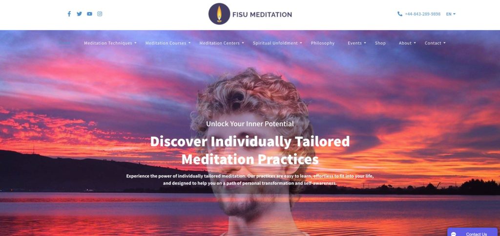
FISU Meditation
What Business Owners and Clients Say
From startups to established brands — here's what working with Digital Drew SEM looks like from the other side.

I worked with drew and his team and had a great experience. He is very knowledgeable but takes the time to try to explain things so you can understand. I am not a tech savvy person and very few marketing terms made any sense to me - but he took the time to try to explain in many ways so I could understand our strategy and pros and cons. He was also extremely constructive and collaborative - he would share the way he thought it should be done - if I had issues he would rework and try to accommodate my concerns and come back with other ideas. I would highly encourage anyone who is considering expanding their marketing strategies to meet with Drew and his team!

Working with Digital Drew has been a game changer for our business. Their expertise in boosting our online presence has significantly increased our website traffic and customer engagement. The team is professional, responsive, and results-driven, making the entire process seamless. I highly recommend Digital Drew for anyone looking to take their digital marketing to the next level!

Drew's team is terrific! They're prompt, professional and attentive. I'm not a techie, and they consistently go the extra mile to ensure I understand each process, with regular checkpoints to review data and options. They're really the best!

Drew has done a great job assessing my business's unique needs and goals, crafting a tailored plan that addressed every aspect of my online presence. His attention to detail and commitment to staying up-to-date with the latest trends ensured that my brand stood out in a crowded digital landscape. Any questions or concerns I had were addressed promptly and thoroughly, providing me with peace of mind throughout our collaboration.
Digital Drew SEM vs the Alternatives
| What You Get | ⭐ Digital Drew SEM | Generic Web Studio | DIY / Template Builder |
|---|---|---|---|
| Conversion Strategy Built In | ✓ Yes | ⚠ Rarely | ✕ No |
| SEO-Ready Architecture from Day One | ✓ Yes | ⚠ Sometimes | ✕ No |
| PageSpeed 90+ Out of the Box | ✓ Yes | ⚠ Often Slow | ✕ No |
| Custom Design (Not a Template) | ✓ Yes | ⚠ Sometimes | ✕ No |
| Analytics + Tracking Set Up at Launch | ✓ Yes | ⚠ Extra Cost | ✕ No |
| You Own the Site Outright | ✓ Yes | ✓ Usually | ✕ Locked In |
Straight Talk on What It Costs
Scoped on the strategy call, a brochure site for a solo consultant and an e-commerce platform for a product brand don't need the same depth of work. Fixed-price quotes, no hourly billing surprises.
Business & service sites
A focused scope built around your core services and conversion goals. Clean, fast, and optimized to turn visitors into leads without overcomplicating the build.
E-commerce & custom platforms
Broader scope covering product pages, checkout flows, integrations, and performance optimization, built to handle scale and convert at every stage of the funnel.

How I Build Websites That Perform
I built Digital Drew SEM after years running marketing for Fortune 500 companies and leading agencies, on one premise: you deserve a team accountable to revenue — not one hiding behind jargon and vanity metrics.
I've seen businesses invest thousands in websites that looked impressive but were slow, difficult to use, and failed to generate leads or sales. That's the gap we close. If we're not the right fit, I'll tell you on the call.
WordPress vs Shopify: Which Platform Is Right for Your Business?
Every business has different goals. We recommend the platform that best fits your business, products, and long-term growth—not the one that's easiest for us to build.

Choose WordPress If...
- ✔ You need a lead-generation website
- ✔ SEO is your top priority
- ✔ You want complete design freedom
- ✔ You need custom integrations
- ✔ You want full ownership of your website

Choose Shopify If...
- ✔ You primarily sell products online
- ✔ You want a simple store management system
- ✔ You need built-in payments & checkout
- ✔ You want inventory & shipping tools included
- ✔ You want to launch quickly
What Businesses Ask About Building a Responsive Website
Responsive web design means your website automatically adjusts its layout, content, images, navigation, and interactive elements to fit different screen sizes. The goal is to provide a smooth experience across smartphones, tablets, laptops, and desktop monitors.
Mobile visitors expect pages to load quickly, text to remain readable, buttons to be easy to tap, and navigation to work without zooming or horizontal scrolling. A responsive layout reduces friction and makes it easier for visitors to browse and take action.
Yes. Depending on the condition of your current site, we can improve existing layouts, rebuild problem sections, modernize navigation, optimize media, and adjust mobile behavior without always requiring a complete website replacement.
Yes. Our Responsive Web Design Services can incorporate mobile usability, page performance, clean architecture, internal linking, crawlable navigation, metadata, heading structure, and other technical foundations that support organic search visibility.
Not necessarily. Responsive design keeps the brand and content consistent while allowing layouts to adapt to the available screen space. Elements may stack, resize, move, or simplify on smaller devices so the experience remains easy to use.
We review key pages across multiple screen sizes and browsers, checking navigation, forms, buttons, images, spacing, readability, loading performance, and conversion paths to identify issues before the site goes live.
Stop Losing Business to a Website That Doesn't Work
Book your free strategy call. We'll review your current site, walk through what's costing you leads, and tell you honestly what a new build would take.